How to Use Pops of Colour for an Instant Home Refresh
December 4, 2023 - Michelle Murphy
Colour is a powerful design element used to shape atmosphere, highlight architectural details, and reflect your personal style.
But, using TOO much colour in your design can quickly overwhelm your space, so choosing the right spots to add little splashes of colour is one of my fave ways to create a cohesive look that has maximum impact.
Today, I’m excited to share some practical tips and ideas on how to integrate pops of colour in your home. Let’s get started!
What Exactly Are ‘Pops of Color’?
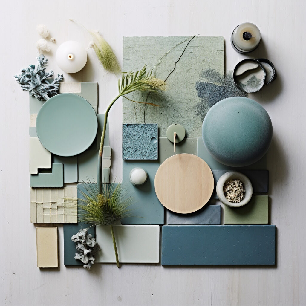
When we talk about pops of colour in interior design, what exactly do we mean? Simply put, a ‘pop of colour’ is a small but intentional use of a bold colour, typically set against a more neutral backdrop.
So why does this matter?
Well, the psychology of colours tells us that different hues have the power to evoke a range of emotions and reactions. Understanding this psychological impact is helpful when selecting the right pops of colour for your space. You want your room to look good, but also feel good, right?
8 Ways to Add Pops of Colours
There are sooooo many ways to add impactful pops of colour to your design. Here are some of my favourites!
#1: Decor Accents
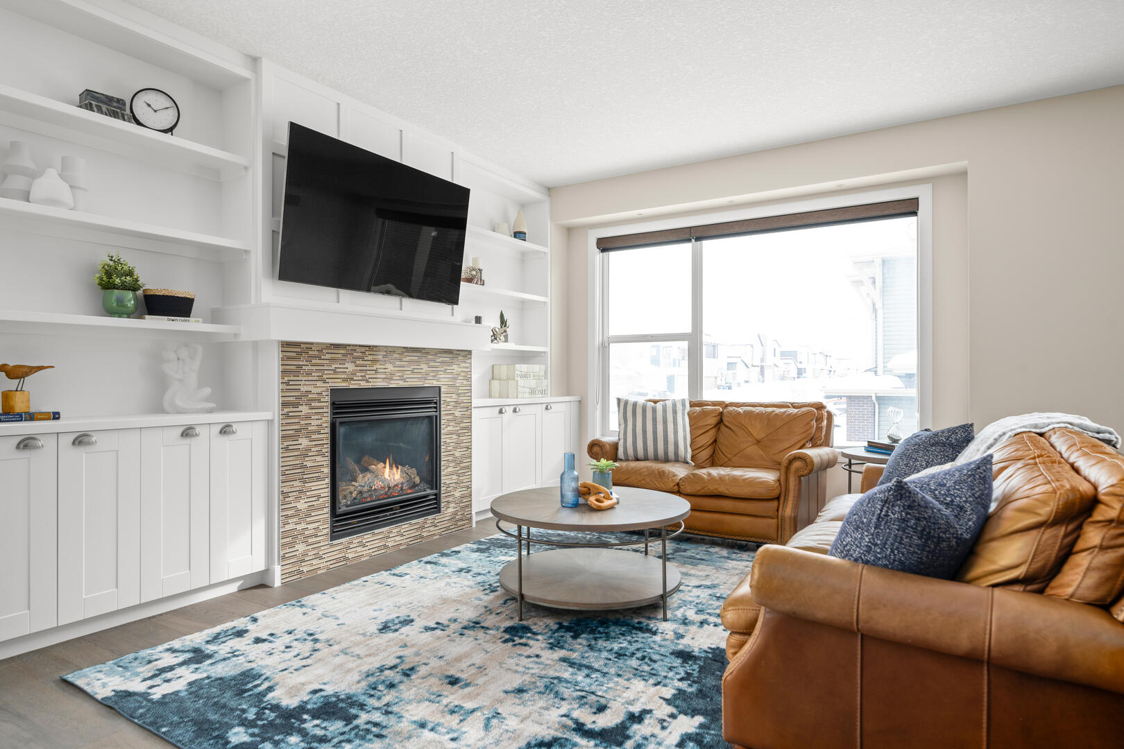
- Throw Pillows and Blankets: These are a quick and cost-effective way to introduce colour. Why not try a lemon yellow throw on a grey couch or play with different shades of blue pillows? You can even mix and match different hues and textures for a layered look.
- Curtains and Rugs: These larger pieces can be used to help define your space. For example, a rug with a geometric pattern can introduce multiple colours and serve as a visual anchor in your living space. Curtains in a bold colour can dramatically alter the room’s look, especially when contrasted with the wall colour. Speaking of curtains, check out our ultimate guide to window treatments.
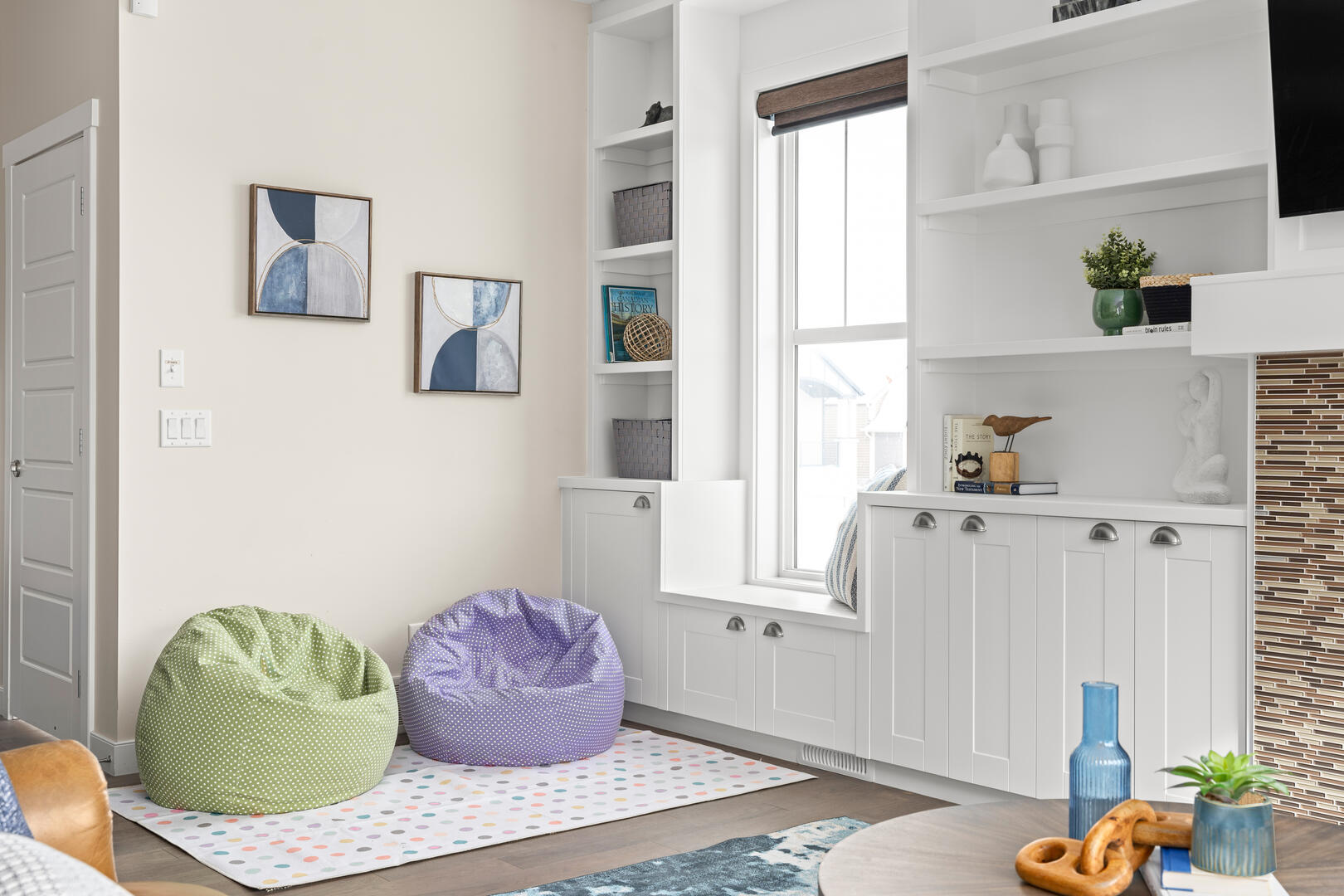
- Wall Art and Accessories: Framed art, sculptures, or colourful bookends can add personality and colour without permanence.
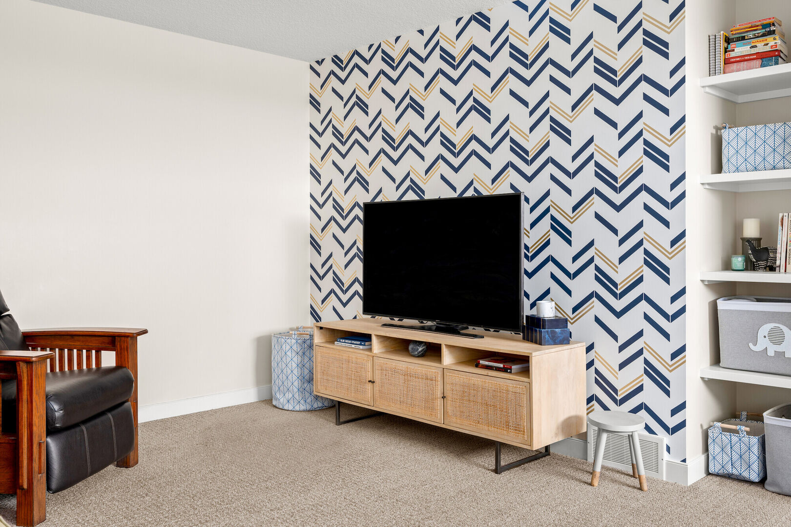
#2: Accent Walls
Painting or wallpapering a single wall in a bright or deep colour or print can create an intentional focal point without overpowering the room. This works especially well in neutral spaces or smaller rooms where a full paint job might feel too intense. A wallpaper like this with a more neutral pattern and pop of color in the background is a great way to pull in some color without overpowering the space.
#3: Statement Furniture A brightly coloured sofa, armchair, or sideboard can become the centrepiece of your room. It’s a more significant commitment than decor items, but it can dramatically change the feel of your space. Just remember, when choosing a statement piece of furniture, consider its overall impact on the room. Also, make sure to consider the commitment of a bold piece of furniture because you will likely have it for years to come.
#4: Lighting & Fixtures
Lighting fixtures can be artistic expressions, so don’t overlook them! A lamp with a colourful base or a stained glass pendant light can add a subtle hue to the room and amp up the ambience. Even switching to smart bulbs that offer coloured light options can add a unique touch for special occasions or moods.
#5: Plants & Flowers
Greenery adds a fresh, beautiful element of natural colour, and you can easily incorporate a variety of plants with different foliage colours and textures. Consider flowering plants for seasonal colour changes, or use colourful pots and planters to add a burst of colour, even in smaller, compact spaces like balconies or window sills. Even faux plants are a great way to bring in a pop of color without the care and maintenance of a real plant.
#6: Kitchen & Bath Accents
Bright backsplashes or coloured cabinetry are great ways to incorporate pops of colour in kitchens and bathrooms, but you don’t have to go that bold if you don’t want to. Smaller touches like coloured towels, mats, decorative dishware, or even small appliances and fixtures (like a colourful kettle or shower curtain) can still have a big impact.
#7: Textiles & Upholstery
If you don’t want to splurge on a piece of statement furniture, you can always try reupholstering a classic chair or adding a colourful tapestry to a blank wall. These changes can add a splash of colour and texture and make the room feel more inviting and personal.
#8: Seasonal & Temporary Touches
Seasonal decorations, throw blankets, and even holiday-specific items allow you to play with colours temporarily. Think pastels for spring, brights for summer, earth tones for fall, and deep, rich colours for winter. Rotating these elements can keep your home feeling fresh and in tune with the time of year.
Pro Tip Freebie: Follow the 60-30-10 Rule! This classic decorating principle suggests that 60% of a room should be a dominant colour (like walls and large furniture), 30% a secondary colour (like curtains and accent chairs), and 10% an accent colour (like decorative items and artwork). This ratio helps create a layered effect that feels cohesive, not chaotic.
Make Those Colours Pop!
So, we’ve learned that adding pops of colour is a simple and effective way to enhance the aesthetics of your home. Also, don’t hesitate to refresh your decor with new colours as your preferences evolve. Experiment with different elements like decor accents, statement furniture, and lighting to find what works best for your space.
Ultimately, it’s about creating a home environment that feels right for you. Go ahead and give those pops of colour a try!